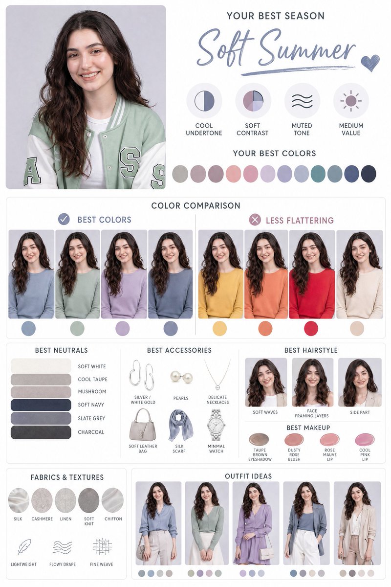
请根据我上传的人像照片,制作一张高质感个人色彩分析图卡。保留主角原本五官、肤色、脸型与真实特征,透过左右或并排对比方式,展示不同服装颜色穿在主角身上的效果,清楚区分「适合色」与「不适合色」,让人一眼看出哪些颜色最衬肤色、提升气色与整体质感。版面设计需干净时尚、像专业形象顾问报告,整体以视觉呈现为主,只使用简短标签(例如:推荐、普通、避免),不要加入长段文字。高解析度,资讯清楚,适合社群分享。
Based on the portrait photo I uploaded, create a high-quality personal color analysis card. Keep the subject’s original facial features, skin tone, face shape, and real characteristics. Use left-right or side-by-side comparisons to show the effect of different clothing colors on the subject, clearly distinguishing “suitable colors” and “unsuitable colors,” so viewers can immediately see which colors best complement skin tone and improve complexion and overall texture. The layout design should be clean and fashionable, like a professional image consultant report, mainly visual, using only short labels (e.g., recommended, average, avoid), and no long paragraphs. High resolution, clear information, suitable for social media sharing.