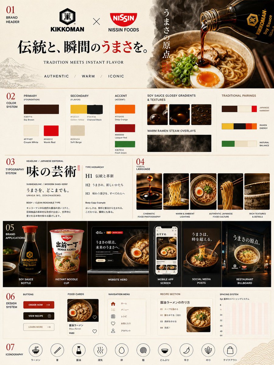
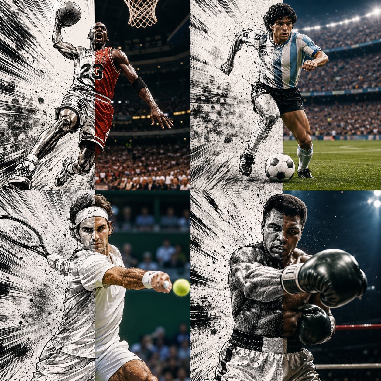
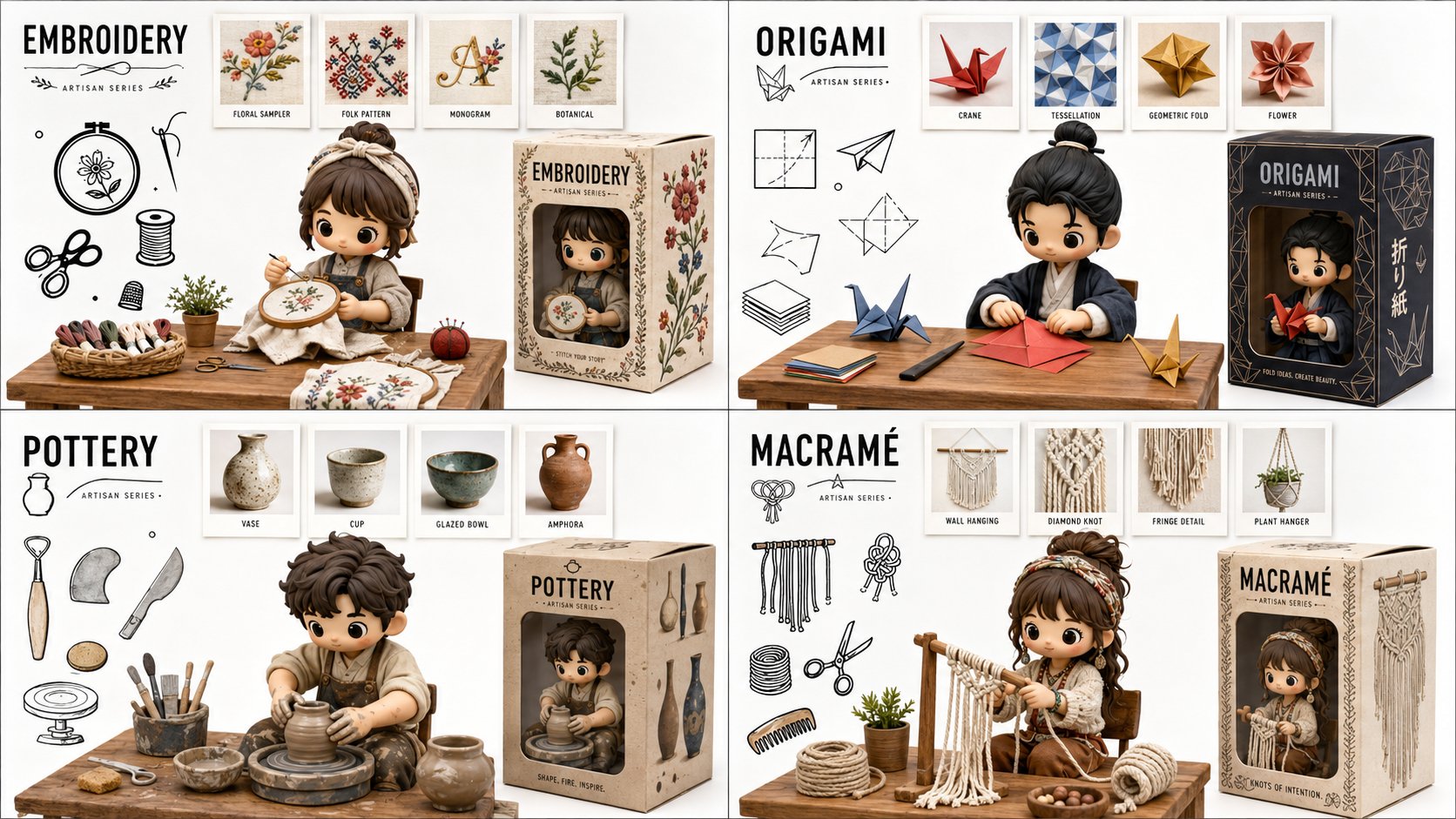
[
品牌名称
] 担任高级品牌艺术总监和编辑设计师,
负责创建 2×2 网格品牌情绪板——包含四张风格迥异的编辑卡片,
并以 [
品牌名称
] 的视觉识别系统为统一标准。参考案例:Ivy Park 宣传活动编辑、Supreme 产品图册排版、Palace Skateboards 杂志设计、Off-White 编辑网格、Highsnobiety 品牌专题报道。 --- 第0阶段:品牌智能——自主研究 在生成任何视觉效果之前,
请先从训练数据中对 [
品牌名称
] 进行完整的品牌解码。自动提取并应用以下所有内容: 颜色系统:明确品牌的主色和辅助色——它们的具体十六进制值,
以及它们在层级结构中的运用方式(主背景色、强调色、文本色)。这些颜色驱动着网格中的每一张卡片。 字体排印DNA:确定[
品牌名称
]使用的确切字体或字体类别——衬线体、无衬线体、窄体、宽体、无衬线体、粗体。确定字重层级:标题、正文和标签分别使用什么字重。将此排印系统应用于所有四张卡片。 品牌语言:确定品牌的语气、关键短语、宣传口号、产品类别、创立年份、主要合作伙伴和文化定位。提取关于[
品牌名称
]的真实信息,
并将其作为四张卡片的文本内容——真实的产品名称、真实的宣传活动标题、真实的日期、真实的地点和真实的品牌宣言。 视觉符号:识别与[
品牌名称
]相关的摄影风格——时尚大片、运动、街头、奢侈品、工业风。识别该品牌使用的构图模式——全出血摄影、文字主导布局、纯图形构图、拼贴画。 所有四张卡片上的文字内容都必须是关于[
品牌名称
]的真实信息——不能是占位符文字,
也不能是通用文案。必须是真实的品牌标语、真实的产品线、真实的营销活动名称、真实的品牌创立信息。 --- 第一阶段:电网系统 最终输出是一张由四个大小相同的矩形卡片组成的图像,
这些卡片以 2×2 的网格排列。图像整体尺寸为正方形或略呈横向——比例为 1:1 或 4:3。每个卡片大小相同——正好是图像总面积的四分之一。卡片之间留有 4 到 6 像素的细缝——根据品牌色调,
缝隙颜色可以是中性的深色或浅色。这四个卡片构成一个统一的编辑系统——它们共享相同的色调和字体,
但每个卡片都有其独特的布局风格。它们共同讲述品牌故事。 --- 第二阶段:卡片 1 — 英雄专题报道(左上) 版式排版:醒目的大号字体,
叠加或融入照片之中。主背景色:[
品牌名称
] 的主品牌色,
饱和度最高,
铺满整个卡片。照片:与 [
品牌名称
] 视觉形象相关的时尚或生活方式图片——模特、产品或环境。照片可以全出血显示在文字下方,
也可以裁剪到卡片的特定区域,
文字占据剩余空间。照片处理:与背景色轻微融合,
使照片和背景浑然一体。字体:[
品牌名称
] 最具辨识度的标题或标语,
采用卡片上最大的字号——粗体、窄体、大写、白色或品牌辅助色。文字足够大,
可以部分覆盖照片。辅助小字:品牌名称、地点、日期——采用小型大写字母或字距较窄的小字,
置于角落。整体风格:杂志封面或宣传海报。 --- 第三阶段:卡片 2 — 编辑文本布局(右上角) 版式:以文字为主的编辑版式,
配有小型图片插页。背景:[
品牌名称
]的辅助品牌色或与品牌色调一致的深色中性色。大标题:[
品牌名称
]的真实活动标题或品牌宣言,
分多行显示——每行字体大小或粗细不同,
营造出阶梯状的视觉效果。最大一行字体非常大,
最小一行字体中等,
左对齐,
形成参差不齐的右边缘。小正文栏:一段真实的品牌信息——例如品牌故事、产品描述或活动背景——采用常规小号字体,
位于卡片的右上角或右下角。图片插页:一张小型矩形照片——占卡片面积的20%至30%——位于标题文字的上方或下方,
与标题文字形成对比或重叠,
营造出视觉张力。照片带有品牌主色调的彩色边框。 --- 第四阶段:卡片 3 — 时尚专题(左下角) 版式布局:以摄影为主导,
文字作为结构性背景元素。摄影:一张引人注目的时尚或产品图片——模特身着[
品牌名称
]产品,
或一张重点产品特写。照片位于卡片左侧50%至60%的位置,
并进行紧凑裁剪。照片处理:略微降低饱和度或提高对比度——采用编辑级黑白或品牌专属色调。背景文字:在照片后方和周围,
使用[
品牌名称
]品牌标识中的超大单个单词或字母——高度为卡片高度的200%至300%,
采用品牌主色或辅助色,
作为照片背后的背景。此背景文字部分被照片遮挡。正文:一列[
品牌名称
]品牌文案——3至5个短段落,
采用细体常规字重,
位于照片右侧。摘录语:从正文中提取的一句话,
字体更大,
采用品牌强调色,
位于照片和正文之间。 --- 第五阶段:卡片 4 — 简洁的品牌声明(右下角) 版式类型:极简、图形化、品牌识别声明。背景:白色、米白色或[
品牌名称
]色卡中最浅的色调——与其他三张卡片形成最大对比度。主要元素:[
品牌名称
]的文字商标或品牌名称,
采用醒目的字体——根据品牌的字体设计,
可采用超粗体、窄体或加宽字体。文字商标分为2至3行,
每行左对齐,
占据卡片宽度的70%至80%。字体颜色:黑色或品牌最深的颜色——在浅色背景上形成最大对比度。次要元素:位于卡片右边缘的模特或产品图片,
略微裁剪——以人为本,
使图形布局更加稳固。模特/产品并非重点——重点在于字体。强调元素:年份、数字、系列标识或品牌标语,
采用品牌主色调,
以小字呈现——作为上标或脚注位于主文字商标附近,
增添手写或印章质感。 --- 第六阶段:统一视觉系统 四张卡片的字体风格保持一致:所有文字均采用与[
品牌名称
]品牌形象一致的字体。标题字体:一种字体,
一种字重——选择最醒目、最能代表品牌的选项。正文字体:一种字体,
常规字重——即使在小字号下也清晰易读。不使用任何装饰性或无关的字体。色彩一致性:四张卡片仅使用第0阶段确定的颜色——主品牌色、辅助品牌色、中性色(白色或黑色)以及一种强调色。不使用任何超出此色系的颜色。不使用渐变色。不使用阴影。文字上不使用任何纹理。信息一致性:所有文本均为[
品牌名称
]的真实信息。不使用lorem ipsum文本。不使用通用占位符文本。每张卡片上的每个词要么是品牌名称,
要么是真实的产品名称、真实的活动标题、真实的日期、真实的地点,
要么是真实的品牌宣言。网格对齐:卡片上的元素共享隐含的对齐轴——卡片1中位于特定x坐标的标题与卡片3中位于相同x坐标的元素对齐。这样,
从整体上看,
2×2 网格就具有视觉上的连贯性。 --- 第七阶段:技术规格 输出:包含完整 2×2 网格的单张平面图像。不提供单独的文件。宽高比:1:1 正方形或 4:3 横向。整体分辨率:足够高,
确保所有正文清晰可读。字体渲染:所有文字均经过抗锯齿处理,
清晰锐利,
无模糊。摄影:编辑级品质,
而非图库照片风格。色彩准确度:品牌颜色与 PHASE 0 中确定的颜色完全一致,
而非近似值。除非是品牌专属纹理,
否则不得添加胶片颗粒。无暗角。无镜头光晕。干净、精准、符合编辑标准。输出效果:此情绪板可发布在 Hypebeast、Highsnobiety 等网站,
或用作内部品牌演示文稿的幻灯片。
[
  BRAND NAME
] Act as a Senior Brand Art Director and Editorial Designer creating a 2×2 grid brand moodboard — four distinct editorial cards unified by [
  BRAND NAME
]'s visual identity system. References: Ivy Park campaign editorial, Supreme lookbook layouts, Palace Skateboards zine design, Off-White editorial grids, Highsnobiety brand feature spreads. --- PHASE 0: BRAND INTELLIGENCE — AUTONOMOUS RESEARCH Before generating any visual, perform a complete brand decode of [BRAND NAME] from training data. Extract and apply all of the following autonomously: Color system: identify the exact primary and secondary brand colors — their specific hex values, how they are used in hierarchy (dominant background color, accent color, text color). These colors drive every card in the grid. Typography DNA: identify the exact typeface or typeface category [BRAND NAME] uses — serif, sans-serif, condensed, extended, grotesque, slab. Identify the weight hierarchy: what weight is used for headlines, what for body text, what for labels. Apply this typography system throughout all four cards. Brand language: identify the tone of voice, key phrases, campaign slogans, product categories, founding year, key collaborators, cultural positioning. Extract real factual information about [BRAND NAME] that can be used as text content across the four cards — real product names, real campaign titles, real dates, real locations, real brand statements. Visual codes: identify the photographic style associated with [BRAND NAME] — editorial fashion, sport, street, luxury, industrial. Identify compositional patterns the brand uses — full bleed photography, text-dominant layouts, graphic-only compositions, collage. All text content across all four cards must be real information about [BRAND NAME] — not placeholder text, not generic copy. Real brand slogans, real product lines, real campaign names, real founding information. --- PHASE 1: GRID SYSTEM The output is a single image composed of four equal rectangular cards arranged in a 2×2 grid. Total image dimensions: square or slightly landscape — 1:1 or 4:3 ratio. Each card is identical in size — exactly one quarter of the total image area. A thin gap of 4 to 6px between cards — neutral dark or light depending on brand palette. The four cards form a unified editorial system — they share the same color palette and typography but each has a distinct layout typology. Together they tell the brand story. --- PHASE 2: CARD 1 — HERO EDITORIAL (top left) Layout typology: large bold typography layered over or integrated with photography. Dominant background color: [BRAND NAME]'s primary brand color at full saturation — fills the entire card. Photography: a fashion or lifestyle image relevant to [
  BRAND NAME
]'s visual world — model, product, or environment. The photo is either full-bleed behind the text or cropped into a specific zone of the card with text occupying the remaining space. Photo treatment: slight blend mode integration with the background color — the photo and background feel like one unified surface. Typography: the most recognizable [BRAND NAME] headline or slogan in the largest type size on the card — bold condensed, uppercase, white or brand secondary color. The text is large enough to partially overlap the photo. Secondary small text: brand name, location, date — set in small caps or tracking-heavy small type in a corner. The overall feeling: a magazine cover or campaign poster. --- PHASE 3: CARD 2 — EDITORIAL TEXT LAYOUT (top right) Layout typology: text-dominant editorial layout with a small photo inset. Background: [BRAND NAME]'s secondary brand color or a dark neutral consistent with the brand palette. Large headline: a real [
  BRAND NAME
] campaign title or brand statement broken across multiple lines — each line a different size or weight,
creating a typographic staircase effect. The largest line is very large,
the smallest is medium,
they are left-aligned creating a ragged right edge. Small body text column: a real paragraph of brand information — founding story,
product description,
or campaign context — set in small regular weight type,
positioned in the upper right or lower right of the card. Photo inset: a small rectangular photo — 20 to 30% of card area — positioned where it interrupts or overlaps the headline text,
creating editorial tension. The photo has a colored border or frame in the brand primary color. --- PHASE 4: CARD 3 — FASHION EDITORIAL (bottom left) Layout typology: photography-forward with typography as structural background element. Photography: a strong fashion or product image — model wearing [
  BRAND NAME
] product,
or a key product hero shot. The photo is positioned in the left 50 to 60% of the card,
cropped tightly. Photo treatment: slightly desaturated or high contrast — editorial black and white or brand-tinted. Background typography: behind and around the photo,
a very large single word or letterform from [
  BRAND NAME
]'s identity — set at 200 to 300% of the card height, in the brand primary or secondary color, acting as graphic wallpaper behind the photo. This background type is partially obscured by the photo. Body text: a column of real [BRAND NAME] editorial copy — 3 to 5 short paragraphs, small regular weight, positioned to the right of the photo. Pull quote: one sentence extracted from the body copy, set larger and in brand accent color, positioned between the photo and the body text. --- PHASE 5: CARD 4 — CLEAN BRAND STATEMENT (bottom right) Layout typology: minimal, graphic, brand identity statement. Background: white, off-white, or the lightest tone in [BRAND NAME]'s palette — maximum contrast with the other three cards. Primary element: [
  BRAND NAME
]'s wordmark or brand name set in massive type — ultra-bold, condensed or extended depending on the brand's typographic DNA. The wordmark is broken across 2 to 3 lines,
each line flush left,
occupying 70 to 80% of the card width. Type color: black or the darkest brand color — maximum contrast on the light background. Secondary element: a model or product image positioned at the right edge of the card,
slightly cropped — human presence that grounds the graphic layout. The model/product is not the focus — the typography is. Accent element: a year,
a number,
a collection identifier,
or a brand slogan set small in the brand primary color — positioned as a superscript or footnote near the main wordmark,
adding a handwritten or stamped quality. --- PHASE 6: UNIFIED VISUAL SYSTEM Typography consistency across all four cards: all type is set in typefaces consistent with [
  BRAND NAME
]'s identity. Headline type: one typeface, one weight — the boldest, most brand-representative option. Body type: one typeface, regular weight — legible at small sizes. No decorative or unrelated typefaces. Color consistency: only the colors identified in PHASE 0 appear across all four cards — primary brand color, secondary brand color, neutral (white or black), and one accent. No colors outside this palette. No gradients. No drop shadows. No textures on type. Information consistency: all text is real [BRAND NAME] information. No lorem ipsum. No generic placeholder text. Every word on every card is either the brand name, a real product name, a real campaign title, a real date, a real location, or a real brand statement. Grid alignment: elements across cards share implied alignment axes — a headline that starts at a certain x-position in card 1 aligns with an element in card 3 at the same x-position. This creates visual cohesion across the 2×2 grid when viewed as a whole. --- PHASE 7: TECH SPECS Output: a single flat image of the complete 2×2 grid. No separate files. Aspect ratio: 1:1 square or 4:3 landscape. Total resolution feel: high enough to read all body text clearly. Typography rendering: all type anti-aliased and crisp — no blurry text. Photography: editorial quality, not stock photography aesthetic. Color accuracy: brand colors exactly as identified in PHASE 0 — not approximated. No film grain unless it is a brand-authentic texture. No vignettes. No lens flare. Clean, precise, editorial. Output feel: this moodboard could be published on Hypebeast, Highsnobiety, or used as an internal brand presentation deck slide.