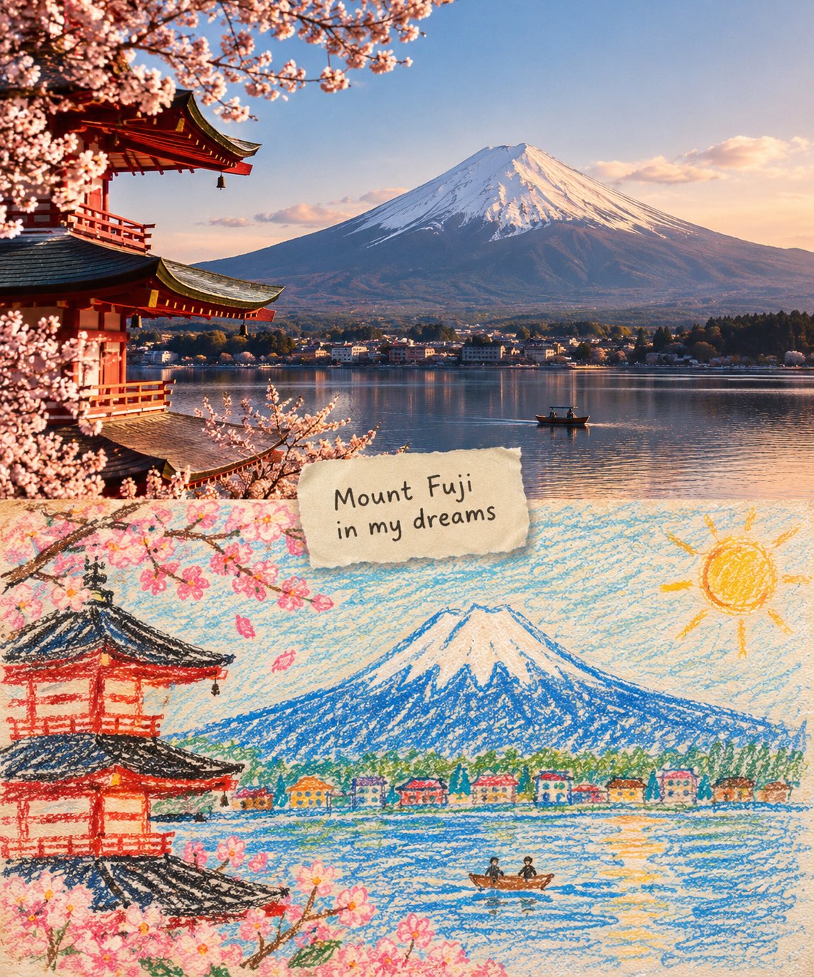
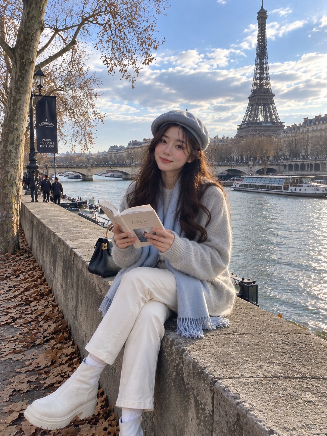
分屏水墨重构
3:4竖构图 · 照片 / 水墨分割 · 当代东方美学
图像为3:4竖构图,分为两个区域,严格1:1比例,每个区域占图像的50%。
上半区域 — 原始照片拍摄区域
保留主体的身份、结构、透视和真实材质、自然光以及原始色彩氛围,仅进行轻微的高级调色和图像净化,以艺术杂志或展览摄影的质感呈现。允许适度扩展背景以适配画面尺寸,但不拉伸、扭曲或重塑主体,不改变主体的结构、姿态和核心构图。
下半区域 — 极简水墨重构区域
首先提炼主体最令人记忆深刻的细节,如轮廓、结构、趋势、透视、节奏和氛围,然后将同一场景重构为极简水墨材质景观。不要复制照片细节,不要做写实复制,只保留最具辨识度的结构和神韵,让人一眼认出下半区域与上方原始照片之间的对应关系。
下半部分整体基底为乳白、暖白或纸白,带有细腻纸纤维和自然肌理。主体通过水墨晕染、干湿交织、飞白、渗化、积墨和留白进行重构,形成安静、克制、诗意的东方视觉。去除次要细节,只保留最有特点的轮廓、结构转折、空间层次和气息,不追求写实完整,而是概括、提炼并留下余韵。用墨以黑、灰、淡墨色调为主,层层递进,浓淡和节奏富有变化。
可以从原图中提取最鲜活的颜色,形成少量染色或着色点,而不是机械复制色值。颜色可以局部转化为清透蓝灰、远山蓝、柔金、暖黄、朱红、淡青等,以强调主焦点和情绪节奏,但整体构成仍以墨色和负空间为主。避免沉闷、厚重、旧棕、过度装饰和俗艳配色。
主体核心区域应更加精炼和集中,边缘逐渐松动、破开、消失和散开,与大面积负空间形成呼吸感。下半部分的构图应占约30%–45%,其余保留为大面积留白。构图可以偏置、框取、悬置或略微裁切,但必须保持非对称平衡和高级编辑感。负空间不是空白,而是视觉结构的重要组成部分。宁可减少信息,也不要填满整个画面,使主焦点看起来像页面上展示的一枚水墨印记或东方材质作品。
文字处理
文字只允许极少量的编辑介入,不预设标题和编号。可以从主体、地点、时间、动作、情绪或隐喻中提取少量词语或短句,安静地放置在空白区域或主体边缘。文字应克制、稀疏,并有呼吸感,不喧闹或占主导。
整体呈现
当代东方美学,极简水墨重构,大尺度艺术留白,小尺度印章意象,安静的编辑版式和展览海报风格。避免复杂背景、堆砌真实细节、过度装饰、过量文字、模板化布局和填满式构图。
Split-Frame Ink Wash Reconstruction
3:4 vertical composition · photo / ink wash split · contemporary Eastern aesthetic
The image is in a 3:4 vertical composition, divided into two regions, with a strict 1:1 ratio, each taking up 50% of the image.
Upper Region — Original Photo Shoot Area
Preserves the subject's identity, structure, perspective, and true material, natural light, and original color atmosphere, with only slight high-end color grading and image purification, presenting it with the texture of art magazines or exhibition photography. It allows for a moderate expansion of the background to fit the screen size, but does not stretch, distort, or reshape the subject, without changing the subject's structure, posture, and core composition.
Lower Region — Minimalist Ink Wash Reconstruction Area
First, refine the subject with the most memorable details, such as the outline, structure, trend, perspective, rhythm, and atmosphere, and then reconstruct the same scene into a minimalist ink wash material landscape. Do not copy the photo details, do not make a realistic copy, only preserve the most recognizable structure and charm, allowing people to recognize the corresponding relationship between the upper region and the original photo at first glance.
The overall base of the lower half is milky white, warm white or paper white, with delicate paper fiber and natural texture. The main body is reconstructed in ink wash blending, dry-wet interplay, flying white, seepage, ink accumulation, and white space, forming a quiet, restrained, and poetic Eastern visual. Removing secondary details, only retaining the most distinctive contours, structural turns, spatial layers, and breath, not pursuing realistic completeness, but rather summarizing, refining, and leaving a lingering impression. The use of ink in black, gray, and light ink tones, layered and progressing, with varying intensities and rhythms.
The most vibrant colors can be extracted from the original image to create a few spots of dyeing or coloring, without mechanically replicating the color values. The colors can be transformed locally into clear blue-gray, distant blue, soft gold, warm yellow, vermilion red, light cyan, etc., to emphasize the main focus and emotional rhythm, but the overall composition is still dominated by ink tones and negative space. Avoiding dull, heavy, old brown, excessive decoration, and vulgar color combinations.
The main core areas should be more refined and concentrated, with edges gradually loosening, breaking away, disappearing, and scattering, forming a sense of breathing with the large negative space. The lower half of the composition should account for about 30%–45%, with the rest reserved for large negative spaces. The composition can be biased, framed, suspended, or slightly cut, but must maintain an asymmetrical balance and a high-end editorial feel. Negative space is not blank, but an important component of the visual structure. It is better to reduce information than to fill the entire image, so that the main focus looks like an ink seal or an oriental material work displayed on a page.
Text Treatment
Text is only allowed a very small amount of editing intervention, without preset titles and numbers. A small number of words or short sentences can be extracted from the subject, location, time, action, emotion, or metaphor, and quietly placed in the blank area or the edge of the subject. The text should be restrained, sparse, and have a sense of breathing, not noisy or dominant.
Overall Presentation
Contemporary Eastern aesthetics, minimalist ink wash reconstruction, large-scale art blank, small-scale seal impression, quiet editing layout and exhibition poster style. Avoid complex backgrounds, piled-up real details, overly decorative, excessive text, template layout and filled composition.